Principles of Good Design:
Here’s a quick look (with photos) to illustrate a few of the key principles and to highlight the bad! Be informed about what you are looking at as you browse for your inspirations.
Also, we each have inner sensibilities when it comes to what we feel looks right or not. You may want to read-
Is Your Personal Design Style Asymmetrical or Symmetrical?
One principle that underlies great design is that all the elements are consistent or congruent, which creates a cohesiveness to the total picture. This is not so much about symmetry but whether the elements are cohesive (unless there is a purposeful break to said consistency). When the elements are cohesive, in that way, there’s a feeling of harmony. When the elements are ‘thrown in’ without cohesiveness or with true purpose, then there can be a discordant feeling around the look. This is nuanced and could be an in-depth topic, for another day. Something for you to be aware, in a general way, of as you look around for house ideas.
Great design has a soft ‘oh, that’s really nice’. There is ‘something’ about it that feels right. Great design comes from the whole being greater than the sum of its parts. All of the tiny parts and details add up. It’s a different feeling than the ‘wow’ one may get when looking at a striking vaulted ceiling.
Poor design leaves a ‘hmmm?’ feeling. Like you aren’t quite sure what you are looking at and why it looks off but it just does. There is something(s) not quite right about it.
If you decide on Craftsman style, then all the architectural elements inside and outside should reflect that style. Also be consistent with where they are placed too. If crown molding is installed in all of the main rooms, then have it go down the hall and into the bathrooms too. Don’t skimp.
It’s ok to depart and mix it up but only if you choose to do that in a mindful way. A great designer could be of help to depart, in a creative way, that works. Don’t be confused by the many times where you see a mixed bag of elements that are not done well. When I see that, I assume someone didn’t know any better.
Below you’ll find quick examples. Some are meant to highlight good, consistent design. Other examples are to illustrate bad design and what I call ‘functionally bad.’
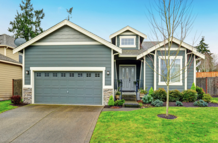
Cohesive or Congruent Design
There are numerous adjectives for this design concept. Harmonious, balanced, unified look and feel. All of the elements fit together.
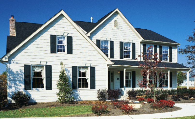 The windows and shutters are all the same. The two peaks match in pitch and shape. There’s only horizontal siding (no vertical elements thrown in). It’s a simple house design overall and it works because there’s nothing ‘wrong’ with it. It’s cohesive.
Inconsistent on Purpose
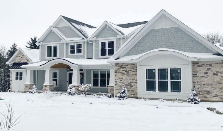
Pointed peaks all match in shape, the windows are roughly the same (consistent). While the windows are squared off and the peaks and columns are angular, then a curve is thrown in! Actually, 2 curved arches. They are a different element but look purposeful and created with intent. It works.
Nice ‘weight’ on the bottom with the beefy columns and stone, almost like it holds up the lofty pointed gables above. Imagine how different the front would look if there were small, round columns instead of these?
I don’t care for a few small details, such as the stone in far left gable end. It looks random to me and I think that gable should match the others.
Incongruent Design Elements
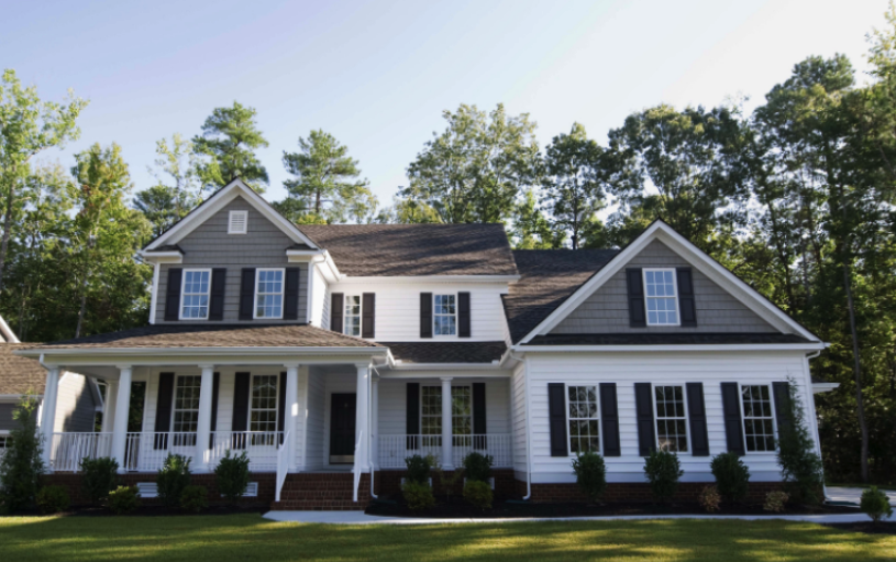
What is that in in the center of the house with a strange roof and off kilter placement of windows?! That center section looks like an after thought, especially with the two roof sections unrelated to the gable ends not being joined in some way.
Also odd choice of colors on the second floor. Why are two parts painted tan and one is white?
One gable end has two windows while the other one has one. One gable end has returns on the roof and the other does not. There is little cohesiveness between the shed style roof over the center porch and the roofs on either side.
And the front entrance area…no thanks. Weird roof convergence, a column splits the window unnecessarily and you can barely see the front door.
Overall, the house has a discordant feel to me.
Functionally Bad Design
3 roof systems all pour down on the front entrance. Sure, there are gutters, but gutters get overwhelmed in heavy rains and who wants a cluster of downspouts at their front entrance? Additionally…it just looks bad to have that narrow, dark entrance. No thanks.
Hope this helps and happy building,
Julie
You've got this!
Remember..
- Find your perfect team (banker, designer, architect builder, etc.) who shares the vision
of what you want and how you want it done. - Trust your gut!
- Acquire the right knowledge, at the right time.
- Successfully build your dream!
![]()